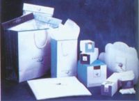
Color application of carton packaging design (below)
The custom color of the carton pack is an important visual language, which makes it easy for people to have a strong direct or indirect psychological induction, so that they have a corresponding rich association. The psychological role of color is complex, and it varies with the country, region, ethnicity, and religious belief. The carton packaging and decorating colors are based on people's corresponding associations and feelings of custom in color, and are highly exaggerated and novel.
2. Textile packaging carton: commonly used in black, white, gray levels of the relationship, in the reconciliation for comparison. For women's textiles, bright colors and elegant colors are used.
3. Pharmaceutical packaging cartons: commonly used pure cold and warm color to express. If tranquility is expressed in blue, green indicates pain relief, and warm colors such as red, orange, yellow and brown indicate nourishing, health care and refreshing; black indicates toxic; red and black blocks indicate highly toxic. The tendency of coloring of pharmaceutical packaging reflects the association and symbolism of color, and specifically shows the indirect psychological induction of color.
4. Cosmetic packaging cartons: Elegant colors are commonly used in cosmetic packaging design, and are generally based on midtones. The use of pink, pink, and light rose colors is aromatic, soft, and noble. For some men's cosmetics, black is sometimes used to express solemnity.
5. Children's products packaging cartons: commonly used bright and eye-catching solid colors, composed of contrasting colors of cool and warm to show a lively, lively feeling.
The composition of the color matching color of the carton package has the same hue matching, the matching of the same saturation, and the combination of similar hue. To achieve the harmony of color matching, the color tone must be unified first. The sense of unity of coloration can exist only if there is some commonality and similarity between colors. These commonalities and similar colors are combined, although they can be unified in terms of cooperation, but if only such a unity, it may lead to a monotonous peace talk of carton packaging and decoration, in order to overcome the monotony and peace must be required to have a unified Changed. In the application of color, we should pay attention to several basic principles of color coordination:
2. The contrast of color is on the twelve-hue circle. The colors of the two top-to-bottom colors are called contrasting colors. There are brightness contrast, purity contrast and color contrast ratio. Only by contrast can the colors express the image correctly. The main tones of carton packs are composed of contrasting colors, which gives a vivid, clear, leaping, and intense contrast. In the layout of products, it is easy to express attention. Of course, in contrasting color design, the contrast should be just right, so that the carton packaging decoration is gorgeous and elegant, and China is not floating, resulting in harmonious and harmonious beauty.
3. The hue of the symmetry of the color should be consistent with the visually symmetrical requirements, consider the color of the cold and warm feelings, pay attention to the mix of warm and cold colors. In addition, in order to make the carton packaging decoration can produce a symmetrical effect, in addition to matching different colors, you can also use the size of the area to deploy.
4. The master of color, for a carton package decoration, in the change of color coordination, we need to start with the color relationship of the entire decoration, using color perception principle to express the theme of outstanding ideas. Of course, according to the theme it expresses, there should be corresponding priorities, so the matching of colors should determine the main hue, follow the principle of other colors subject to the main hue, and be consistent with the main hue, while ensuring the main hue Saturation and reality.
The color composition design of the carton packaging The color composition of the carton packaging and decorating should be subordinate to the overall shape structure. In the formation of the relationship between color and beauty, the color of the decorative surface should be selected, configured, and vividly contrasted, excessive and coordinated, and created. The beauty of color structure. To use color for composition is to arrange two or more colors together, so that they together show a clear and distinctive features.
1. The emphasis on color In the carton packaging and decorating design, in order to highlight the characteristics of the packaged product, the color emphasis is often applied. The general use of the hue of the integrity of the area, the size of the color contrast and the color brightness and purity and other methods.
2. The rhythm of color makes use of the brightness, purity, and some changes in the hue of color to make the color of carton packaging and decoration produce its own rhythm and form the rhythm of color. It is an important factor that forms the sense of form of the picture, and there are many Change, such as strength and strength, size, light and shade, hardness, softness, height and weakness. The rhythm of gradual change, repetition and activity is used to form a rhythm in which the carton packaging and decoration mutually restrict and advance each other, reflecting natural harmony.
3. The color separation is relatively weak due to the adjacent colors, in order to better perform, often need to be separated between them, usually with gold, silver, black, white and gray and other hue. The shape of the split color can be a line and a certain color patch, but pay attention to the influence of the split color on the lightness and purity of the main hue.
In short, pay attention to the feelings of color in carton packaging and decoration design, rationally apply the theory of color psychology, reflect the characteristics of packaged goods, optimize the relationship between the striking and understanding of packaging, and pursue the unity and coordination of the overall hue of making consumers feel good about it. .
Custom Color Pencils Pouch,Sketch Pencils Pouch,Push Pull Pencil Sharpener,4Pcs Sculpture Modeling Stylus
Zhoushan Shenglan Trade Co., Ltd.  , https://www.seamiart.com